Citi Pond at Bryant Park.
During the winter season, CitiBank promotes the ice rink at Bryant Park. This promotional campaign ran from 2011 to 2013.
NY Addy Awards Gold - Citi Pond Brand (2011)
CitiBike Identity
Assignment:
Design anew branded bicycle share programfor New York City that was sponsored by our client, Citi.
Challenge:
The identity and voice of the program needed to win over and speak to the savviest and opinionated of New Yorkers. We understood the program needed to be more than a sponsor logo to achieve our goal.
Solution:
We needed to insure that CitiBike became the city’s bike, so we named it such. By combining the brand name Citi with the most simple of words; bike, we set apart and created a friendly matter of fact expression. The pixel pattern is inspired by Citi ‘s signature blue wave and the jagged skyline and street grids of New York.
Result:
Overwhelming city wide support for the program and our client.
Coffee-mate invented and has led the creamer category since 1961. Try to leverage this storied past to drive core equity in the future. Instead of amnemonic, explore historical iconography to develop a library of assets that will connect all 2016 initiatives and inform Masterbrand launch.
Created look and feel for entire Homewood Suites collection.
Égalité (French for Equality and pronounced eh-gah-lee-tay) is Publicis Groupe’s Business Resource Group (BRG) for lesbian, gay, bisexual and transgender (LGBT) employees and their allies.
Égalité is committed to enhancing the company’s reputation as an employer of choice for LGBT employees and their allies by promoting equality in the workplace, supporting the LGBT community and helping to develop leaders who can elevate our clients’ brandswithin the hearts and minds of the LGBT community. Our programming is focussed around advocacy, education, community outreach (internal and external) and business development.
Napa is an auto parts retailer that has over 6,000 stores nationwide.
Our challenge was to find a way to highlight Napa’s range of parts in a unique way.
We answered the challenge by combining Napa’s most popular parts with a part-a-day calendar. We designed the Part-a-Day calendar to be reminiscent of an era when mechanics were local and filling stations were on every other corner. Each day features a different Napa part and the holidays are marked with special treatments.
Printed in only 2 colors, the calendar embraces the DIY aesthetic that every mechanic has. The calendars were distributed to all Napa retailers throughout the United States.
Featured in Communication
Arts Design Annual 2014
Featured in FPO awards annual 2014
NY Addy Silver Winner
The imagery from the campaign helps to establish the idea of “A World of Experiences Worth Sharing” by depicting our guests experiencing something that is available through their travels with us.
In most cases, our imagery features more than one person to reinforce the sharing component. Images with individual people are possible though, so long as the viewer “feels” the presence or point of view of their companion.
Images can also be treated as line art that alludesto the global passport or currency feeling. Work shows an image from the HHonors brand campaign.
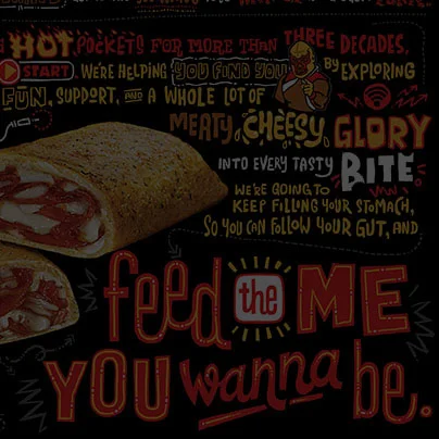
Our big idea was to "be hungry for more. Just never be hungry." We leveraged typography to create a fun poster that showcased the Hot Pocket with brand purpose.
Silver Graphis in the 2017 Poster Annual.